Chubb – Design system & digital guidelines
Summary
Chubb, one of the world’s largest insurance providers, needed a unified digital presence to replace a patchwork of disconnected websites, portals, and apps. Their global business spans multiple regions and specialist insurance lines, each with its own digital touchpoints. A consistent, scalable system was needed to tie it all together, visually and functionally, while allowing flexibility for different teams and markets.
Challenge
The main challenge was twofold: to create a centralised design system that could enforce brand consistency across Chubb’s digital platforms, and to ensure it was flexible enough to support a wide range of business needs. From direct-to-customer journeys to broker platforms, each product required varying levels of complexity, tone, and content. The system had to work at scale, without becoming rigid or overly prescriptive.
Process
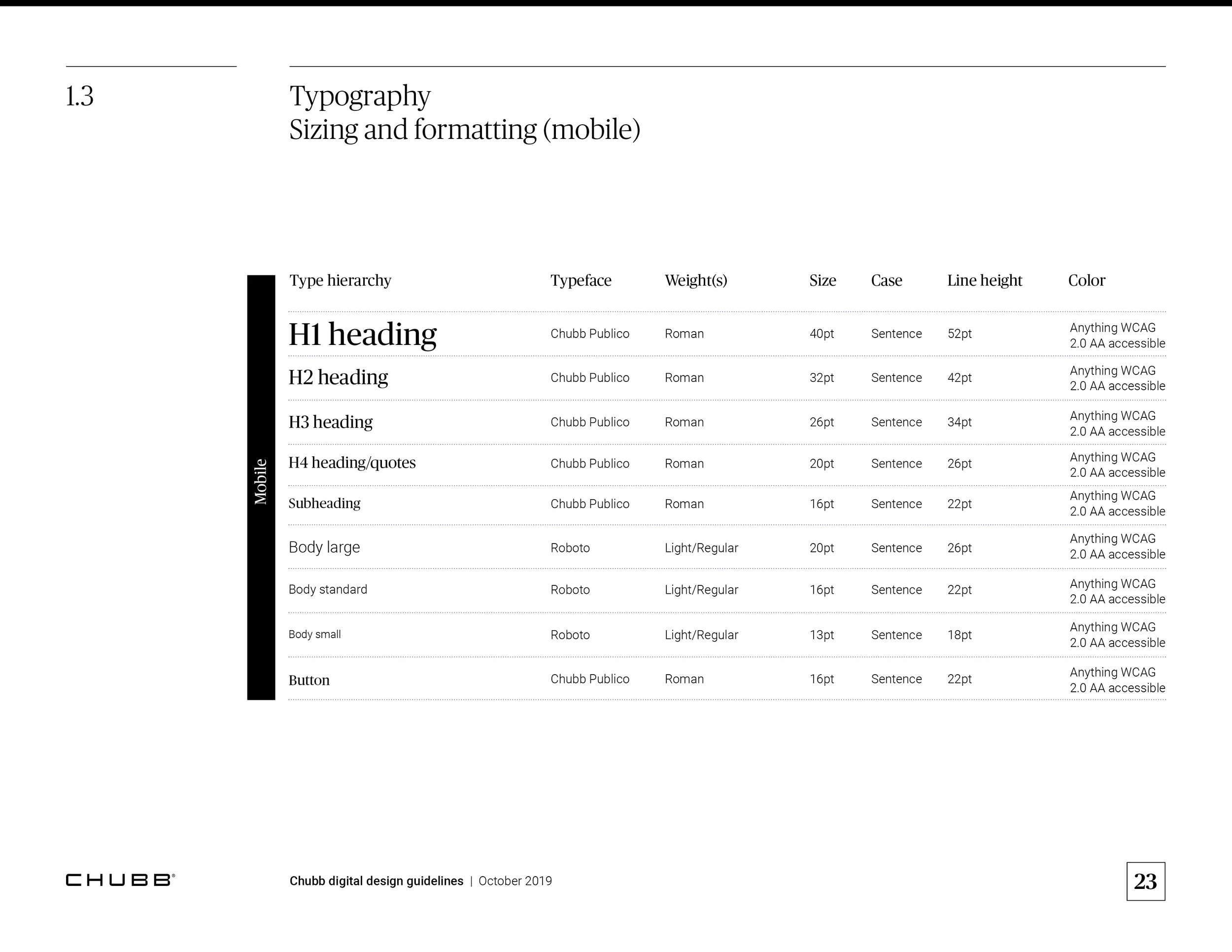
I built the design system from the ground up in Figma, developing a scalable structure based on three key layers:
Building blocks – foundational tokens like colour, typography, spacing, and grid
Elements – smaller patterns such as buttons, inputs, and icons
Components – reusable modules like navigation, forms, content cards, and CTAs
I worked closely with internal teams to audit existing digital products, identify reusable patterns, and define system rules and usage guidance. Alongside this, I designed a set of core page templates, including the homepage, product listing pages, contact and claims pages, showcasing how the system could flex across layouts and content types. These templates were used to help guide adoption across global teams and inform future development work.
Outcome
The final system delivered a cohesive digital experience across Chubb’s ecosystem, reinforcing brand integrity and improving usability. The guidelines and components made it easier for teams to design and build consistent, accessible interfaces, while still giving them the flexibility to adapt to local content and user needs. The redesigned core pages demonstrated the system in action and served as a scalable starting point for future rollouts.
Role:
UI, UX, Design, Branding